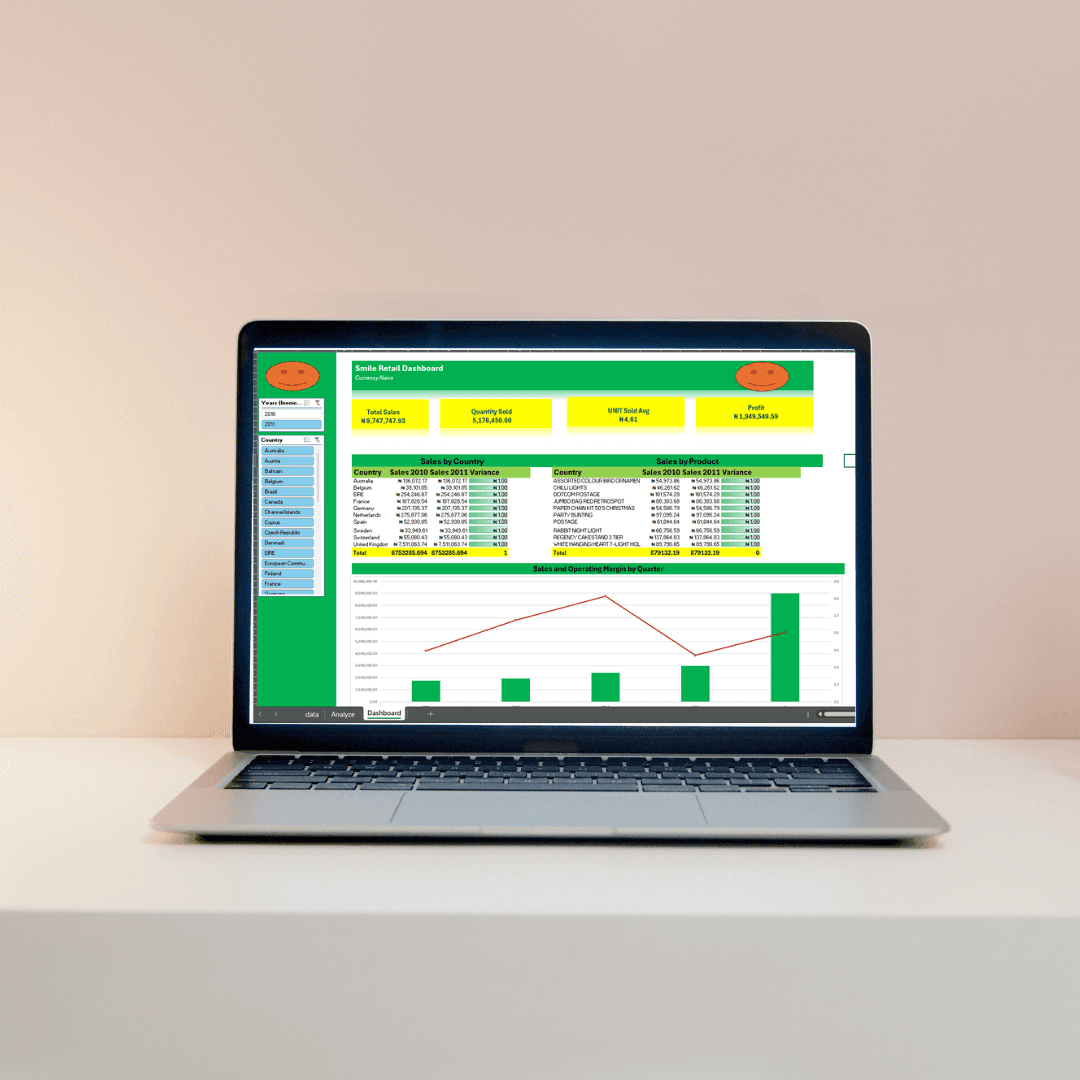
The Smile Retail Dashboard is a dynamic, interactive reporting tool designed to analyze sales performance and operational efficiency for a retail business. Built entirely in Excel, the dashboard visualizes key business metrics such as total sales, profit margins, and product performance across multiple dimensions, allowing stakeholders to make informed, data-driven decisions. A comprehensive video tutorial accompanies the dashboard, detailing the entire build process from data cleaning to final visualization.
Excel File Link: Click Me
Video Link: Click Me
My Approach
The approach involved leveraging Excel’s powerful pivot tables and charting tools to transform raw sales data into actionable insights. Data from over 4.8 million units sold, with total sales of ₦8.99 million and an average unit price of ₦4.48, was cleaned and analyzed using advanced data wrangling techniques. The dashboard was designed with a focus on ease of use and accessibility, ensuring that key metrics such as total sales, quantity sold, and operating profit are available at a glance.
Vision and Innovation
The vision behind this project was to create a versatile tool that could be used by retail managers to monitor sales performance and operational health across multiple countries and product lines. Innovation came through the integration of advanced pivot tables, slicers, and interactive charts, allowing users to explore data by year, quarter, and country. The dashboard emphasizes clarity and visual appeal, ensuring that even complex data is easy to interpret.
Identifying Unique Challenges
Retail businesses face the challenge of consolidating vast amounts of data into meaningful insights. With data spanning multiple countries and product categories, it was essential to design a solution that enabled quick, insightful analysis without overwhelming the user. The use of Excel’s powerful filtering and visualization tools solved this challenge, allowing for seamless navigation through large datasets.
Resolving Complex Problems
One of the core problems addressed in this project was ensuring the scalability of the dashboard. With sales data from over 10 countries and dozens of product categories, the dashboard was optimized for speed and performance, ensuring that it remains responsive even with large datasets. The data cleaning process involved removing duplicates, standardizing country names, and correcting erroneous entries, ensuring the integrity of the final analysis.
User-Centric Design
The dashboard was designed with the end-user in mind, prioritizing usability and clarity. A series of slicers allows users to filter data by year, quarter, country, or product, making it easy to focus on specific areas of interest. The charts and graphs are designed to be both visually appealing and informative, ensuring that users can quickly grasp trends and insights.
Meeting User Needs
For business stakeholders, the dashboard provides real-time insights into sales performance, allowing them to track key metrics like total sales, profit margins, and quantity sold. The interactive filters allow users to drill down into specific countries or product categories, giving them the ability to monitor performance at a granular level. The backend data cleaning process ensures that all metrics are accurate and reliable, empowering users to make informed decisions based on trustworthy data.
Detailed Pages and Features
Home (Dashboard): A comprehensive overview showing total sales, quantity sold, average unit price, and profit. Interactive charts display sales by country, product, and quarter.
Sales by Country: An analysis of sales performance across 10 countries, with detailed variance calculations showing year-over-year growth.
Sales by Product: A breakdown of sales performance by product category, highlighting top-selling items and identifying areas for potential growth.
Quarterly Sales & Operating Margin: A detailed chart illustrating sales and profit margins over the year, highlighting key periods of high performance.
Accessibility and Optimization
The dashboard is optimized for performance, ensuring quick loading times and smooth interaction even with large datasets. Additionally, it has been designed to be accessible to non-technical users, with intuitive controls and clean, easy-to-read visuals. The integration of A11y standards ensures that the dashboard is accessible to users with disabilities.
Conclusion
The Smile Retail Dashboard offers a powerful, intuitive tool for retail businesses looking to gain deeper insights into their sales performance. By blending advanced Excel features with clean, user-friendly design, this dashboard allows businesses to monitor key performance indicators in real time and make informed decisions based on accurate, actionable data.


